DESIGN PRINCIPLES
26/8/19 - 25/9/19 (Week 1 - Week 5)
Farissa Eryna Sham (0336814)
Design Principles
Exercises & Projects
Final Project
For our final project, we had to produce a work of design that reflects my interpretation of culture. I believe culture is something that unites people. For this project, I decided to produce a work regarding 'festivals' because I strongly feel that festivals in Malaysia really do unite people from different races and religion. Personally, I celebrate all sorts of festivals like Hari Raya, Chinese New Year, Deepavali and various more. I find festivals really fun and exciting too and I know many people look forward for a particular festival annually.
To start off with this project, I sketched out and wrote down some of my ideas in my sketchbook. I also did not forget to use the design principles I have learned through out this module. Here are pictures of my sketches and notes.
Fig 15.1 Research
In Fig 15.1 I wrote down my idea for this project and what culture means to me.
Fig 15.2 Notes
I decided to portray 4 races in Malaysia which is Malay, Chinese, Indian and Kadazan-Dusun. I divided them into 4 similar squares.
Fig 15.3 Composition idea
To make the objects in the squares look much clearer and interesting I figured I could add shapes to sort of frame the objects infront of it.
Fig 15.4 Ideas for project
I took some pictures in Kuala Lumpur that I could relate to my work.
Fig 15.5 Saree shop
I came across this shop in Little India and what I observed was there were tons of colors for each saree. I find them really beautiful and I even bought one for myself.
Fig 15.6 Cheongsam
This shop is called Emerald Brilliant and they sell cheongsams and I took this picture because I can refer to this for my sketch.
Fig 15.7 Baju Kebaya
I took this picture to show the traditional wear for Malay culture. There are many shops that sell traditional wear for Malays near my house.
Once I got enough materials for my project, I started drawing the outline for my work. I used a pencil to do so. Here are pictures of the process of completing this project.
Fig 15.8 Hari Raya
I started off by drawing the traditional wear for each culture in the shapes drawn.
Fig 15.9 Chinese New Year
Fig 15.10 Picture of the whole drawing
In fig 15.10 I managed to draw all the traditional wear for each culture. Next, I started coloring it with acrylic and water color paint. I made sure I used bright colors and colors that complimented each other.
Fig 15.11 Process
Fig 15.12 Tadau Kaamatan traditional wear
Fig 15.13 Process 2
After I have colored all the traditional wear, I moved on to the background. I wanted to use a lot of mediums for this project as we used many types of materials for the exercises in this module.
Fig 15.14 Background for Hari Raya
I painted the triangle shape pastel pink because my idea was to make all the shapes' color pastel. I also added a cut out paper mosque to make it pop up. I used a small piece of sponge and add it at the back of the mosque so it'll definitely look 3D. I used acrylic paint to outline the doors on the mosque. For the skin, I used dots to fill it as I feel like it looks interesting that way.
Fig 15.16 Ketupat
In fig 15.16 I added ketupat as it is one of the main dishes for Hari Raya. I used pen and color pencils to draw and color it. I made it three dimensional as well.
Fig 15.17 Process for deepavali
In fig 15.17 I cut out a paper for me to put on top of the paint in fig 15.18.
Fig 15.18 Paint
Fig 15.19 Deepavali light lamp
I added the oil lamps because on Diwali/Deepavali, houses are lit up with oil lamps, candles and colourful electric lights. Traditionally, the earthen lamps with cotton wicks are lit in most of the houses. Since, Diwali is celebrated on the new moon day when it is absolute darkness everywhere, people light millions of lamps to get rid of the darkness.
Fig 15.20 Tadau Kaamatan
I started painting the background for Tadau Kamatan. I did some research on the festival and I found out that Kaamatan or Pesta Kaamatan is a form of harvest festival celebrated annually in the state of Sabah in Malaysia. Kaamatan is referring to the paddy-harvesting period which explains why I painted the background that way (fig 15.20).
Fig 15.21 Grass medium
In fig 15.21, I added this paper/medium that is exactly like real grass and I felt like it compliments the idea of the festival.
Fig 15.22 Close up
I painted a light pastel peach color with a hint of orange for the background.
Fig 15.23 Background for chinese new year
For the background, I wanted to do a Chinese pattern. I did some research on what do Chinese patterns look like and I found many of them. This picture is what I referred to while doing the pattern. I also used a coin to make the perfect circle.
Fig 15.23 & 24 Reference
Fig 15.25 & 15.26 Process
After completing the background, I painted the shape.
Fig 15.27 Process 2
Fig 15.28 Final outcome for final project
I added objects that are related to each of the festivals like the Chinese dragon, Muruku (famous snack for deepavali), traditional instruments for Tadau Kamataan. They pop up if seen in real life.
Design principles applied in this project:
- Pointilism
- Depth
- Repetition
- Perspective in value
- Physical texture
- Rhythm
I'm quite satisfied with how my work turned out. I knew from the start I wanted this work to contain many types of materials and I wanted it to reflect something that unites people. I also made sure I include most of the design principles we have learned as this is our final project. I had so much fun doing this and hopefully Ms Sherry and Ms Jinchi likes my work too.
Project 1 - Self Portrait
21/10/19 - 11/11/19 (Week 9 - Week 12)
For our first project, we were told to do a self portrait by applying the various principles that you had learnt through these weeks. We were required to make a visit to Kuala and observe the surroundings. For example the people, vehicles, buildings, plants, signages, nature, activities. So I recorded my research in photographs, video recordings, notes and sketches.
Firstly, I planned out where to go in KL for this project. I wanted to go somewhere that has a lot of information/visuals regarding the culture I grew up in. I made a list. (Fig 14.1)
Fig 14.1 Planning
I only managed to visit Central Market, Brickfields and Little India.
At Central Market, I discovered a lot of traditional crafts and art. Since I am doing a research on my culture (malay culture), I visited "Malay Street/Lorong Melayu" which is found inside Central Market.
Fig 14.2 Notes
I saw different types of crafts and art. Wood Carving have existed since a long time ago among Malaysians especially the Malays, ethnic communities of Sabah and Sarawak and the Orang Asli. Here is a picture of a shop that sells millions of wood carving works.
Fig 14.3 Wood carving
Then, I encountered a shop called "Kampung Batik" and it reminded me of the type of designs and art I was exposed to at a young age. I used to do a lot of batik on my own as it was a well known type of textile art in my culture. In my family, almost all the women I know wears batik at home and for festivals. I own a lot of "kain batik' too as I wear it for many occasions. So I decided to include this in my project because my culture has affected me in the way I dress.
Fig 14.4 Batik shop
Here is a close up picture of a batik. This picture is taken from Google.

Fig 14.4 Example of a batik
I also roamed around at the alley full of food stalls. I came across this stall that sells a lot of "kuih". The term kueh or kuih is widely used in Indonesia, Malaysia, Brunei, and Singapore, to refer to sweet or savoury desserts. In my culture, or for most Malaysians, we usually eat "kuih" in the afternoon as "makan petang" which is something like tea time. Usually, my mother would buy kuih almost every day at the same time which is around 5/6 pm.
Fig 14.5 "Kuih" stall
Fig 14.6 More pictures of the stall
When I was about to leave Central Market, I saw this big 'Wau Bulan' sculpture so I took a picture of it. I used to make many "Wau" in my primary school because we had many traditional arts and crafts competition. So I figured, I should include this in my self portrait. Wau bulan is an intricately designed Malaysian moon-kite that is traditionally flown by men in the Malaysian state of Kelantan.
Fig 14.6 Wau
This is a picture of me in front of the building. It was a very sunny day.
Fig 14.7 Picture of me
Next I visited Brickfields in Kuala Lumpur. I took many pictures that reflects me. To answer the question 'Who am I?' for this project, I see myself as an introvert person and quite reserved. I also appreciate times spent alone. So I took a few pictures that describes that answer. Here is a picture of notes I made.
Fig 14.8 Notes
I successfully took a few pictures that describes me and is relevant for my self portrait. These pictures describes how I am most of the time.
Fig 14.9 Picture 1
Fig 14.10 Picture 2
I find these pictures (fig 14.9 & 14.10) describe these words best 'introvert and reserved'. So I included this in my self portrait.
In Malay culture, I grew up hearing this from many people about an old belief which is 'JANGAN ambil gambar bertiga, nanti salah seorang mati' (Do not take photos of three people, one of them will die). It was believed to have been created circa 1930s when camera and photography came into Malay society. Since everyone wanted to be in the photo, the fourth person would feel envious as he/she was not invited to join in.
Fig 14.11 'Jangan ambil gambar bertiga'
The next place I visited was Little India. I took this picture because of the mosque. Religion is a part of culture. Masjid or Mosque is the place of worship of the Muslims.
Fig 14.12 Mosque
At the mosque, I managed to take a picture of these small boys greeting their 'Ustaz' at the mosque which describes my culture really well and how culture affects the way we greet people.
Fig 14.13 Greeting
So once I gathered enough materials for my self portrait, I did a rough sketch of the composition for my work and wrote down some notes.
Fig 14.14 Sketch
Fig 14.15 Numbers
I printed out the pictures I took in KL to include in my work and I cut them out.
Fig 14.16 Pictures
For the first picture, I cut out most of the background so I could draw it out myself using only lines.
Fig 14.17 First picture
Fig 14.18 Drawing out the background using only lines
I also cut out a part of the second picture so I could draw it myself.
Fig 14.19 Second picture
Then I decided to put in a pop up of the 'Wau' around the picture.
Fig 14.20 Wau
14.21 Painting the wau
I painted the background for this picture using watercolour and included the meaning of the picture. 'Jangan ambil gamber bertiga'. I included words in this work as well.
14.22 Beliefs
Fig 14.23 Process
I drew a few of these 'kuih' using color pencils.
Fig 14.24 Kuih
For the mosque picture, I painted the sky and used paper to construct the mosque. I grew up going to the mosque to pray. In my culture, we go to the mosque for many reasons like to pray, for festivals, funerals and more. Most Malays are born a Muslim there most of the malays that I know are devout Muslims (followers of Islam).
Fig 14.25 Process
Fig 14.26 Mosque
To include batik in my self portrait as I grew up making and coloring it, I decided to make batik as the background of my work.
Fig 14.27 Drawing out batik
I used hot glue to make my batik's flowers and leaves pop up for texture. For this work, i'm using physical texture. Physical texture are the patterns of variations upon a solid surface.
Fig 14. 28 Texture
After drawing out the background, I used paint to colour the background. I also used metallic gold and orange marker to colour the coat of the hot glue.
Fig 14.29 Process
Lastly, for the background I included dots. I added white dots using a liquid correction pen. I think in most batiks there will be usually be many dots included.
Fig 14.30 Dots
Here is my final outcome for project 2.
Fig 14.31 Final Outcome
Fig 14.4 Another picture of the outcome
Close ups of the details.
Fig 14.32 Close up of mosque
Fig 14.33 Close up of pop up words (belief)
Fig 14.34 Close up of the pop up food
Fig 14.35 Close up of 'Wau'
Brief Explanation of my work:
For
my self portrait, I included a few photographs and visuals that I took in Kuala
Lumpur that are relevant and reflects me. The first two pictures describes who
I am and how I see myself. I think of myself as someone who is quite reserved
and introverted and I find those pictures describe those two words best. I used
black lines as the background of the
pictures to make it more interesting and simple. Next, I included words because of its meaning for one of the photographs that portrays a belief
I grew up hearing to which is ‘Jangan ambil gambar bertiga’. I also made some
illustrations three dimensional in the work such as the ‘kuih’, mosque, and ‘Wau
bulan’.My culture has affected me in the type of art I was exposed to at a
young age and I used to make a lot of ‘Wau’ back in primary school. The way I
greet in my culture is also shown in my work and portrayed through a desaturated picture with a red line to
emphasize the activity. Lastly, since I
grew up doing a lot of traditional arts and crafts I decided to make the
background in ‘Batik’ using acrylic paint and hot glue. I applied physical texture to the background as
the glue makes the surface of the work three dimensional. Repetition of white dots are also added for the batik.
FEEDBACK: Ms Sherry said I did a really good job and it is very nice. She also told me she likes batik too.
FEEDBACK: Ms Sherry said I did a really good job and it is very nice. She also told me she likes batik too.
Ilham Gallery Visit
24/10/19 (Week 9).
We visited the Ilham Gallery and we were told to look at the works to identify the design principles used. There were many amazing works from Southeast Asian designers. I was so glad we went to visit it because I got to see how there's so many different techniques and design principles used. It was all different and unique in their own way. Here are some pictures I took at the gallery.
This work is by artist Kamin Lertchaiprasert and it was a part of his
solo exhibition entitled Kamin Vata Atta Uppatan.
Fig 13.1 Kamin Lertchaiprasert
This work is made from laminated wood structure.
Fig 13.2 Chun Kai Feng
This dress is received from the artist's home which slowly evolved into a creative outlet for her. The melancholia of receiving this dress, together with the desire of wearing them, was something she felt she needed to explore.
Fig 13.3 Foo May Lyn.
We were also told to write an essay based on the visit. We had to show what design principles were used in the works found at the gallery. Here is my essay on the works:
EXERCISE 9:
Week 9 (21/10/19)
Topic: Symbols, Image, Words.
My group and I presented for this week's topic. Here is our presentation:
Topic: Symbols, Image, Words.
My group and I presented for this week's topic. Here is our presentation:
For this week's exercise, we were told to use Photoshop. I used a picture that I took of my cousin at a museum. In this exercise I used image as my design principle. I applied the following technique: Opacity, contrast, crop, blur and vector. I desaturated the picture so the subject would be in black and white. Here is my sketch:
Fig 12.1 Sketch
This is the picture chosen.
Fig 12.2 Main picture
I changed the brightness and contrast as can be seen in fig 12.3 so that the white does not look too exposed.
Fig 12.3 Changed the brightness and contrast
Then, I added a picture that has a view of the mountains. I changed the perspective of the picture so it'll look more realistic.
Fig 12.4 Background picture
I also lowered down the brightness and cropped out necessary areas so it'll fit perfectly.
Fig 12.5 Mountain background applied
Afterwards, I cleaned up the black and white picture so the edges doesn't look badly cropped out. I used the eraser tool to do so. Then, I blended the picture with the mountain background so it looks much more realistic. I wanted it to look much darker so I set it up at 'ajdustments'. I applied gaussian blur so it blends well.
Fig 12.6 Process.
In my sketch, I added birds to make it more interesting. So in Photoshop, I applied birds vector.
Fig 12.7 Birds vector.
For the sky, I added a picture that has planets and the colours are very bright and lively. I wanted to add this to the sky as I thought it was too empty before.
Fig 12.8 Chosen picture
I cropped the picture (fig 12.8) and played lowered down the opacity. I blended the image as well. Not to forget the brightness too. I was quite happy with how it turned out so here's my final outcome.
Fig 12.9 Final outcome.
I really liked this exercise so I decided to do another one. This time I used Frida Kahlo's portrait. My concept was the same as the one above.

Fig 12.10 Frida Kahlo's portrait.
My idea was to add bright colours around her and make the portrait look much more lively. I chose a specific colour palette which is something more vibrant and contrasting. My idea was to add life in the image. For the first step, I wanted to add a very bright object at the background so I cropped out a yellow picture and make it into a circle. Somehow it kind of looks like a sun.
Fig 12.11 Yellow background.
Fig 12.13 Cropped a semi-circle.
As I was done with the cropping, I decided to copy the semi-circle to form a full circle. I flipped the picture horizontally.
Fig 12.14 Added another set of semi-circle.
Fig 12.15 Full circle.
Since my idea was to make the picture more lively and bright, I added flowers that had colors which will compliment the yellow circle and the portrait.
Fig 12.16 Flowers.
I also added flowers at the bottom so it sort of looks like a border. I felt like it was too empty if I was to leave it blank. I chose a different set of flowers for the border at the bottom. I layered them more than twice and copied the flowers. (CTRL+C).
Fig 12.17 Flowers border.
To make it simply more fun, I cropped a picture of a blue parrot and placed it on her shoulder. Underneath it is a set of flowers. I played with the opacity, brightness, and contrast. I made sure the colour blended well.
Fig 12.18 Added objects.
Next, I added lines and desaturated them so the focus will still be on the other objects. I placed some of the lines on top of her portrait which covers her forehead and placed some behind her. I felt like the placement of the lines were really important and makes a huge difference.
Fig 12.19 Added lines.
Before I finished everything off, I decided that the black and white lines were okay but to make it much more interesting I changed the color of some of the lines. I changed it by setting the blending mode to "pin light" and "vivid light". As seen in Fig 11.10, some of the lines are in red and some in orange with a hint of yellow. Personally, I felt like it looks nicer with the coloured lines.
Fig 12.20 Lines.
Fig 12.21 Final Outcome.
I think it turned out exactly how I imagined it to be. I am pleased with the outcome and actually might do more of these "digital collage". It was very fun to do because I get to play with the colours, contrast, brightness and much more.
Turns out we had to use a picture that we took on our own for this exercise. I did not know that until Dr Jinchi told me in class. Luckily, I can still create another one which is a picture I took.
FEEDBACK on frida kahlo's portrait: Ms Sherry said it looked really nice and it is really interesting.
Week 8 (07/10/19)
Topic: Rhythm, Movement, Harmony
RHYTHM.
Rhythm is created by repetition with variation to make it visually interesting. It creates a visual tempo in artworks and provides a path for the viewer's eye to follow.There are 5 types of rhythm:
- Alternating Rhythm
- Flowing Rhythm
- Progressive Rhythm
- Random Rhythm
- Regular Rhythm
Alternating rhythm occurs when positive and negative shapes change design at regular intervals. In other words, it is the repetition of two or more elements that are used alternatively with each other.It's common in the creation of patterns.
Fig 11.1 Alternating rhythm

Fig 11.2 More example on alternating rhythm
Flowing rhythm is usually when movement is shown through organic shapes. Some flowing rhythm examples include flowers, clouds, or waves. It describes an artwork that contains curved or circular elements that give the art movement. The elements are slightly different for every interval so the audience can see the rhythm in the movement.
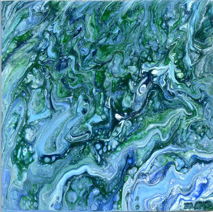
Fig 11.3 Flowing rhythm

Fig 11.4 Example of flowing rhythm.
Progressive rhythm describes an artwork that contains repeating elements in a pattern that change either in size or color as they repeat. It uses motifs to show progression.
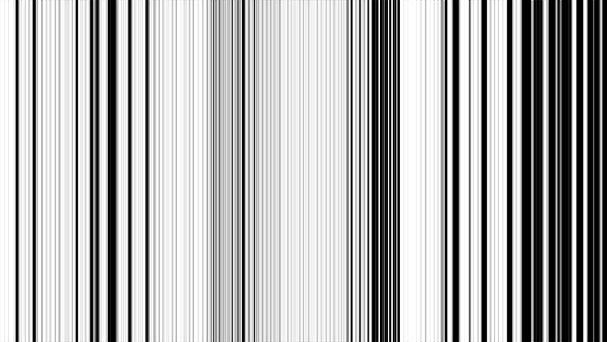
Fig 11.5 Lines with different sizes.

Fig 11.6 Progressive rhythm
Random rhythm describes an artwork that contains repeating elements without a specified order or arrangement.

Fig 11.7 Random rhythm
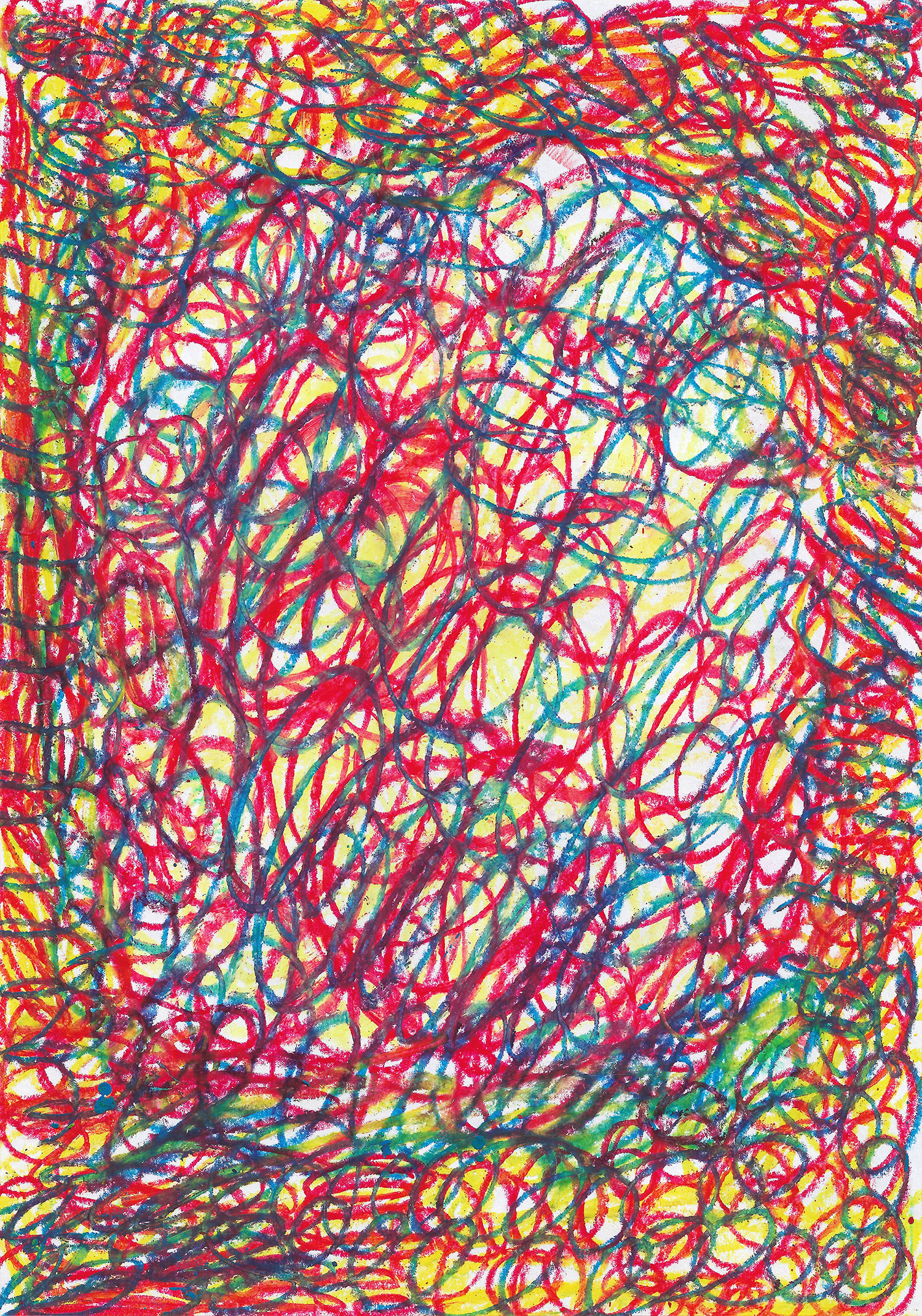
Fig 11.8 Another example of random rhythm
Regular rhythm describes an artwork that contains repeating elements with a specified order or arrangement that can be measured. Some regular rhythm examples include evenly spaced windows or tiles.
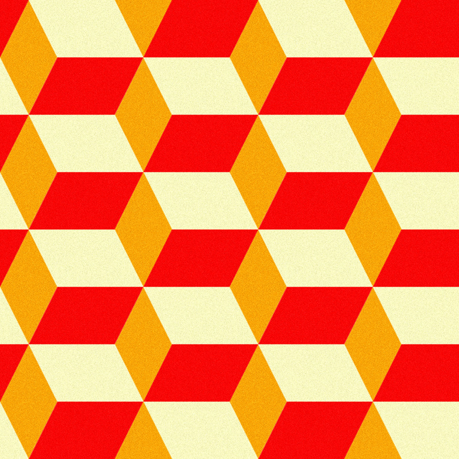
Fig 11.9 Regular rhythm

Fig 11.10 Another example of regular rhythm
MOVEMENT.
Movement is the path that leads the eye through the work to a focal point. Movement can be directed through lines, shapes, colours and more. It is created in art by the way the artist uses the elements of design.
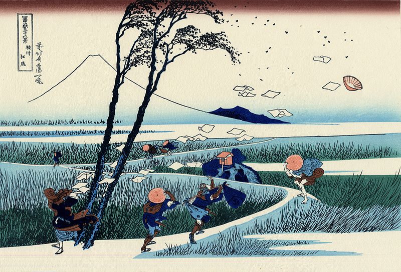
In fig11.11, the movement in the painting can be clearly seen as it is windy.

Harmony is the visually satisfying effect of combining similar or related elements. By keeping the area of contrast smaller than the large harmonious area to be relieved, a visually satisfying balance is achieved.
In fig11.11, the movement in the painting can be clearly seen as it is windy.

Fig 11.11

Fig 11.12 Fast movement
HARMONY.
Harmony is the visually satisfying effect of combining similar or related elements. By keeping the area of contrast smaller than the large harmonious area to be relieved, a visually satisfying balance is achieved.

Fig 11.13 Harmony.
For this topic, we were told to use collage materials and glue. Those were the materials used for this week's exercise. I sketched out my idea before I got started. I used movement and rhythm as my design principle for this exercise. My idea was to paste some materials with colour on a black and white picture. Here is my rough sketch:
Fig 11.14 Sketch.
I cut out this picture from a magazine. Then I cut around the silhouette.
Fig 11.15 Black and white picture
Fig 11.16 Process
Next, I cut a piece of material and a picture of a garden (not sure what it's called) as the same shape as the one in fig 11.16. My idea was to put it behind the silhouette so there will be contrast. Both of these materials are layered on top of each other.
Fig 11.17 Cut out.
Fig 11.18 Garden picture.
Afterwards, I got this paper from a magazine as well. I was looking for a colour that would compliment the layers so I think this shade of blue would be fine. I wanted to create triangles like this example of movement (fig 11.19). I felt like it would be interesting to add that in my work.

Fig 11.19 Example of movement.
Fig 11.19 Magazine paper.
Then I cut out the paper into small triangles with different sizes. From big to small. I cut a small thin line from the paper and only cut them into triangles so it'd be easier and much faster.
Fig 11.20 Triangles
I used glue to apply the triangles and paste the layers together. I made sure the shape of the triangles were scattered.
Fig 11.21 Movement applied
Lastly, I applied the bigger triangles at the left side corner. I also made sure the positions were random and not the same as other triangles. I used both sides of the paper hence the difference in colour. I find cutting the triangles were quite boring and irritating but other than that it was nice to do.
Fig 11.22 Final outcome
EXERCISE 7:
Week 7 (07/10/19)
Topic: Dots, Line, Scale.
A dot is the simplest element of drawing and the smallest unit we can draw. It is used as the starting position of a design such as line and shape. Here are a few ways dots can be used:

Fig 10.1 Dot.

Fig 10.2 Various dots.
Pointillism is a technique of using small dots or large dots to achieve various effects. It can be used by many types of mediums such as paints, pens, pencils, markers and various more.
In fig 10.3 the dots vary in size but most of them are at the same size.

Fig 10.3 Pointilism in pen.
In fig 10.4 the dots are much more bigger and the artist uses different colours to create the shapes, contrast and shadows of the objects.
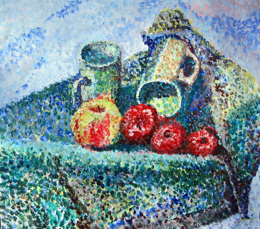
Fig 10.4 Pointilism in painting.

Fig 10.5 Pointilism using color pencils.
LINES.
Lines - a series of points adjacent to each other. It is an element of art used to define shape, contours and outlines, or even suggest mass and volume.
Examples of different types of lines:

Fig 10.6 Various types of lines.
Lines can be used to construct shapes as well.

Fig 10.7 Lines constructing shapes.
Textures created by lines:

Fig 10.8 Textures.
Lines can create many types of design and art. Some artists can draw with only one stroke of line.

Fig 10.9 Line art.
Cross hatching is a technique which essentially is just using lines to create darker areas for shadows. Overlapping these lines will create darker areas and also textures.

Fig 10.10 Cross hatching technique.
SCALE.
Scale - the size of an object in relation to the other objects in a design or artwork. Bigger elements are obviously emphasized more than the smaller objects, and it creates a new perspective for the design.

Fig 10.11 Scale.
Oversized is when an object is larger than how it normally is.
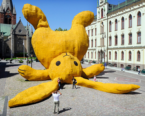
Fig 10.12 Oversized bunny.
Miniature is when an object is smaller than its normal size.
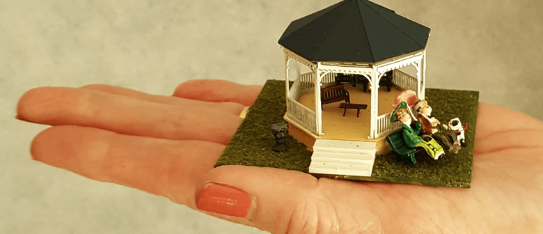
Fig 10.13 Miniature example.
Enormous is when an object exceeds the usual bounds or accepted notions.

Fig 10.14 Enormous astronaut.
For this topic's exercise, I wanted to create a piece by incorporating lines and dots. I chose to recreate Van Gogh's Starry Night by using the mentioned design principle. Here are my sketches:
Fig 10.15 Sketches.
I started off by drawing out the main tree in the painting and I made the outline thicker than the lines inside.
Fig 10.16 main tree in the painting.
I used dots and lines to construct the small houses.
Fig 10.17 Dots and lines.
I emphasized on some of the lines to create a crescent shape.
Fig 10.18 Emphasized lines.
I also drew some of the lines thicker than others for contrast.
Fig 10.19 Thicker lines for contrast.
Fig 10.20 Final outcome 1.
Ms Sherry said in class that we should add color to our work so I decided to do another piece that uses colour. For this piece I used the technique 'pointilism'.
Fig 10.21 Sketch 2.
I used many shades for each color that I used.
Fig 10.22 Background.
I made sure the dots in the middle of the flower is darker.
Fig 10.23 Flower.
Fig 10.24 Final outcome 2.
Week 6 (01/09/19)
Topic: Alignment, Hierarchy, Direction, and Perspective
ALIGNMENT.
Alignment is the placement of visual elements so that they line up in a composition.
It is used to:
- organize group elements
- create balance
- create structure
- create connections between elements
- to create a sharp and clear outcome
The two principles of alignment are edge alignment and center alignment.

Fig 9.1 Alignments.
The picture below shows an example of a good and bad alignment.
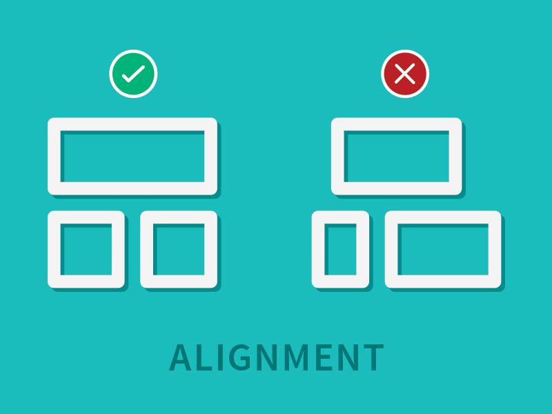
Fig 9.2 Good and bad alignment.
When the visual elements are aligned, the composition is clear, confident, formal, and elegant. The grids are invisible and does not have to have to literally be in the design.
Mixed alignment - If mixed alignment is intended as part of a design, it can appear more radical, dynamic, free and playful.
Fig 9.3 Example of mixed alignment.
Grids can help in alignment by creating an invisible structure or guideline on which the visual elements or text can be placed on. The more grids there are, the more complex the design can be.

Fig 9.4 Grids in alignment.
HIERARCHY.
Hierarchy is the visual information in an arrangement to imply importance. It is used to:
- add structure
- create visual organisation
- create direction
- add emphasis
- help a viewer navigate and digest information easily
Hierarchy in scale - when a design uses thickness to measure importance.
The flow of importance here starts from the top and travels down from thick to thin. The next example challenges this perception.
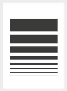
Fig 9.5 Hierarchy in scale.
Hierarchy in colour - thin stroke is perceived as bolder and stronger because it’s more apparent and appears closer, more in focus.
In fig 9.6, the thinnest stroke is the darkest colour and the thickest stroke is the lightest colour.

Fig 9.6 Hierarchy in colour.

Fig 9.7 Hierarchy in colour used in design.

Fig 9.7 Hierarchy in colour used in design.
The color combinations used in a design, and how they relate to one another, are known as its color scheme. A designer’s choice of color scheme can create unity, harmony, rhythm and balance within a creation, but it can also create contrast and emphasis.
Hierarchy in contrast - By contrast the smaller circle is now more prominent.
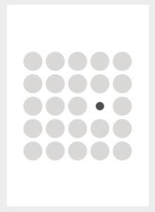
Fig 9.8 Hierarchy in contrast.

Fig 9.9 Another example of hierarchy in contrast.
Hierarchy in space - allows elements to appear closer to the viewer if it is overlapped over another element. Strategic spacing can even draw viewers’ eyes across the page in a targeted sequence, by contributing to page-scanning patterns.

Fig 9.10 Hierarchy of space.


Fig 9.11 More examples of hierarchy of space,
Hierarchy in depth - wants the viewer to focus on the clearest object, leaving the blurry, lighter objects as much further as they seem.

Fig 9.12 Hierarchy in depth.
Hierarchy in perspective has all the elements arranged which puts the flow of hierarchy to start from the darkest (closest to the viewer) to the lightest element (furthest).

Fig 9.13 Hierarchy in perspective.
By utilizing perspective, designers can create an illusion of depth ranging from a few inches to several miles. Because we see similar illusions in the real world, we generally perceive larger objects as being closer than similar smaller objects and, therefore, they usually command attention before any other object on a page.

Fig 9.14 Hierarchy in perspective 2.
DIRECTION.
Direction is a basic element in design that guides the viewer's eyes from an area to another. The three types of direction are:
- horizontal line
- vertical line
- oblique line
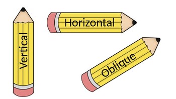
Fig 9.15 Directions.
Horizontal direction is from left to right and vice versa. Designs with horizontal lines give off a calm vibe, promotes stability and tranquility. It comes from the word 'horizon', in the sense that horizontal lines are parallel to the horizon.

Fig 9.16 Horizontal direction in painting.

Fig 9.17 Horizontal lines.

Fig 9.18 Gif of horizontal lines.
Vertical lines travel up and down; they're perpendicular to horizontal lines. They often emphasize height and, in art, leads the eye from bottom to top and vice versa.

Fig 9.19 Vertical direction in art.

Fig 9.20 Vertical direction in image.
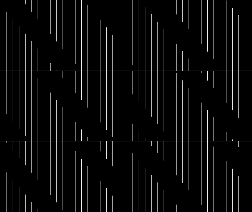
Fig 9.21 Gif of vertical lines.
An oblique direction is a slanting direction. This suggests movement or action.
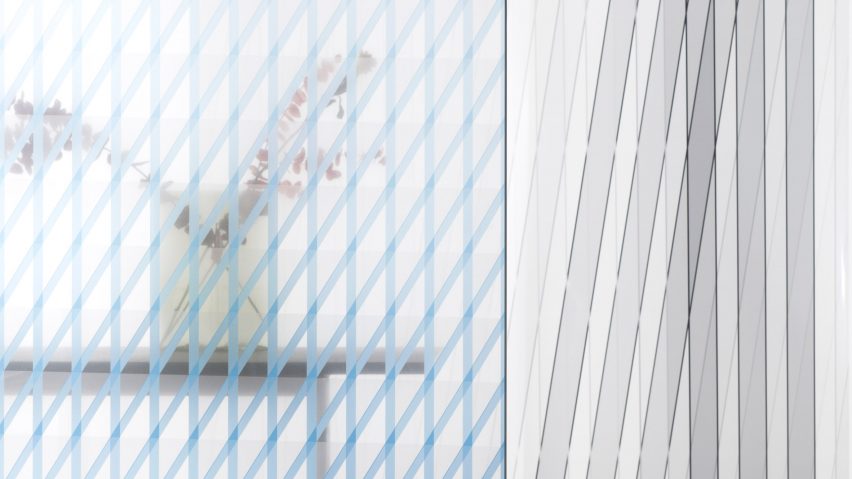
Fig 9.21 Oblique lines.
Oblique lines - There's a third way that two lines on the same plane can meet, and that is when they are oblique, which means tilted or slanted. Lines that are not parallel or perpendicular on the same plane are oblique.

Fig 9.22 Oblique shadow.
PERSPECTIVE.
Perspective indicates depth in a two-dimensional image. The two types of perspectives are linear perspective and non-linear perspective.
Linear perspective uses lines to show the illusion of depth in a picture. The three types of perspectives include the one-point perspective, two-point perspective, and three-point perspective.
One point perspective is a drawing method that shows how things appear to get smaller as they get further away, converging towards a single 'vanishing point' on the horizon line.
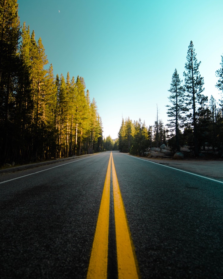
Fig 9.23 One point perspective image.
Two point perspective uses two points placed on the horizon line.
Fig 9.24 Two point perspective drawing.
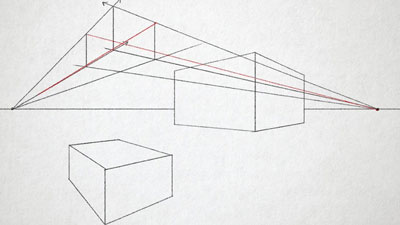
Fig 9.25 Two point perspective vanishing point.
Three point perspective uses three vanishing points.

Fig 9.26 Three point perspective image.

Fig 9.27 Three point perspective vanishing point.
The nonlinear perspective is a technique of depicting volumes and spatial relationships on flat surface. The three types of nonlinear perspective are size variation, colour, and value.
Size variation in art makes smaller objects look farther away in the distance in the distance, while larger objects look closer.
Size variation in art makes smaller objects look farther away in the distance in the distance, while larger objects look closer.
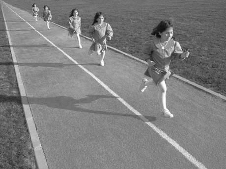
Fig 9.28 Variation in size.
Bright colours appear like they are closer to the viewer while neutral colours appear farther away.

Fig 9.29 Bright colors.
Perspective in value makes lighter values look like they are farther back and darker values look like they are closer.

Fig 9.30 Perspective in value.
Fig 9.31 Perspective in value 2.
For this week's exercise, we were told to use recycled materials. I brought plastic spoons, forks, knives, wooden sticks and newspapers. At first I was not really sure what I wanted to do because It was difficult to use the plastic utilities as it is tough to glue them to the A4 paper, so, I decided to just use the wooden sticks as my recycled material.
I started off with a sketch.
Fig 9.32 Sketch.
The design principle I applied to this work was 'oblique direction'. The first step was to arrange the sticks according to my sketch without applying glue to it yet. I was going to make sure the composition was right.
Fig 9.33 Arranging the wooden sticks.
In fig 9.34, I repeated the step in fig 9.33 and continued doing it until i reach the edge of the paper.
Fig 9.34 Continuing the first step.
Once I was done arranging all the wooden sticks, I was satisfied with the composition. Then I taped on top of the sticks so that I can apply glue on the A4 paper where the wooden sticks will be.
Fig 9.35 Applying tape on the wooden sticks.
After applying glue, I pasted the wooden sticks on to the paper and slowly peeled off the tape.
Fig 9.36 Peeling off the tape.
Once everything was set, I felt like the work was too empty therefore I added a border around the main piece. I used wooden sticks as well for the border.
Fig 9.37 Border.
Fig 9.38 Final outcome 1.
After finishing my exercise, I had a lot of free time in class so I decided to do another set. I sketched my idea out in my sketchbook.
Fig 9.39 Sketch 2.
To start off on my second piece, I wrapped my wooden sticks with a newspaper that has a darker color on the page. The design principle I intended to use was 'hierarchy in depth'.
Fig 9.40 Wrapping the sticks.
In fig 9.41 is the outcome after wrapping the sticks, I used glue as well.
Fig 9.41 Outcome of wrapping the sticks.
My idea was to create boxes out of these sticks so I applied glue to each of them and started constructing the boxes piece by piece.
Fig 9.42 Constructing the boxes.
Fig 9.43 First box.
Unfortunately, as I was doing this work I was rushing to finish it so I didn't have the time to take pictures of the next few steps because it was time for us to have the critique session in class. However I managed to finish it off and here's a picture of the final outcome.
Fig 9.44 Final outcome 2.
Overall, I enjoyed doing both of these pieces and was quite satisfied with how they turned out. I would definitely want to work with these materials more in the future.
NO LECTURE ON WEEK 5 as the group did not present. However we did vegetable stamps in class.
We did this exercise in class using only vegetables, fruits and anything that can be used to stamp on the paper. We were told to bring our materials and I brought onions, garlic, celery, potato and carrots. When I took out the onions and garlic it definitely changed the aroma in class. We started smelling so many different things at once. I also brought a knife to cut the potatoes in to the shape I want.
At first I was struggling with this exercise as I had no clear idea of what pattern I wanted to do. So i started cutting the potatoes into the shape i'd like.

Fig 8.1 Cut out potatoes and individual onion's ring.
I also managed to use the onion's rings to create CIRCLES. After many many attempts, I decided to use the potato's cut out and onions' ring to work on a piece. Fig 8.2 is the outcome.
I decided to use vibrant colours to make my flower pop and the small details blend in with the main object.
Fig 8.2 Finalized piece for pattern.
After we were done, we were told to write feedbacks for any pattern works in class and just be honest whether we like it or not. It was very exciting for me as I get to walk around class and look at other people's work. Different people had different types of technique, composition and use of colours. Some were really good at this exercise too!
Fig 8.3 Feedbacks for me from my classmates.
WEEK 5; Most of the feedbacks I got from my classmates were really thoughtful and positive. It is safe to say most of them liked my piece.
EXERCISE 4:
Topic: Pattern, Repetition, Surface, Texture
Pattern is a repetition of more than one design. There are 4 types of pattern; Meandering, branching, spiral and packing/cracking.
PATTERN.
- Meandering pattern built on the repetition of an undulating line.
Fig 4.1 Example of meandering pattern.
- Branching pattern branches out from one point. For example trees, rivers and more.
- Spiral pattern winds in a continuous and gradually widening curve.

Fig 4.2 Example of spiral pattern.
- Packing and Cracking refers to the way in which compacted cells define each others shape. A densely packed cluster of mushrooms will grow together, deforming the circular form of each cap because of crowding. In the same way a cluster of soap bubbles deforms each bubble from the perfect sphere of the isolated bubble, according to rules that govern the surface tension of soap bubbles. Surfaces (like mud or old paint) that shrink may experience cracking, resulting in similarly cellular patterning.
REPETITION.
Repetition is the repeated use of a shape, color, or other art element or design in a work can help unify different parts into a whole. The repetition might be limited to only an instance or two: not enough to create a pattern or rhythm, but enough to cause a visual echo and reinforce or accent certain aspects of the work.
Sometimes the repeat is used to build a sense of tension and helps us to understand every pieces and details in a design/artwork.

Fig 4.4 Repetition.
TEXTURE.
Texture is the element of art refers to the way things feel, or look as if you could feel if touched (illusion of touch).It is an element of two-dimensional and three-dimensional designs and is distinguished by its perceived visual and physical properties. There are 3 types of textures (Physical, visual and hypertexture).
Physical texture are the patterns of variations upon a solid surface.
Fig 4.5 Physical texture of a rock wall.
Visual texture is the illustration of having physical texture.
Hypertexture can be defined as both the realistic simulated surface texture produced by adding small distortions across the surface of an object.

Fig 4.6 Example of hypertexture
Texture in Painting refers to the look and feel of the canvas. It is based on the paint, and its application, or the addition of materials. There are 4 types of texture in painting; Actual, simulated, abstract and invented.
SURFACE.
Surface design is any type of artwork (pattern, illustration, hand lettering etc) that intended to be applied to a surface to enhance its visual appearance and functionality.
Surface prints such as image above can be applied on homeware, textiles, wallcoverings, for both the fashion and interiors industries.
Fig 4.7 Surface prints.
Repeat patterns print works on huge variety of lifestyle products’ surface
Fig 4.8 Example of print works.
EXERCISE 3:
Week 3 (09/09/19)
Topic: Symmetry, Asymmetry, and Balance
Topic: Symmetry, Asymmetry, and Balance
Asymmetrical balance is considered to be more dynamic because it integrates a variety of shapes, sizes, colors, textures, and lines. Symmetrical balance, on the other hand, is a mirror image arrangement in which elements on either side of a composition match one another. Ms Sherry showed us a couple of pictures that she found symmetrical and asymmetrical in Kuala Lumpur which she finds represent Malaysia. It was a collage of many pictures, it was very fascinating and interesting to look at.
Fig 3.1 Symmetry art
Fig 3.2 Symmetry art.
Fig 3.3 Van Goh's Starry Night (asymmetrical)
The Van Gogh painting, Starry Night, also utilises asymmetrical balance. The tall dark structure on the left is equally balanced out by a completely different element on the right which is the moon. The contrast of balance can also be seen by the arrangement of the elements. The dark structure starts out very heavy from the bottom but becomes less as it goes up. The bright coloured moon on the other hand, is very strong at the top of the right side, which creates not only a symmetrical balance but a shape and colour contrast as well.
Fig 3.4 The Great Wave off Kanagawa (asymmetrical)
Fig 3.5 Asymmetrical piece.
Radial balance is any form of representation that achieves a visual balance through circles. This is achieved where parts of an object or picture are regularly arranged and radiate from the central point.
Fig 3.6 Example of balance.
Fig 3.7 Second example of radial balance.
Before I started off with this exercise, I got inspired by this picture of 'islamic pattern' online and followed some of the lines in the picture but it was in black and white. For the colors, I decided to paint the flowers with red/pink with a hint of yellow and orange. I also had to mix some colors to produce a peachy/orange color. For the background I decided to paint it blue and green but it did not turn out how I wanted it. I am not really good with watercolour but I tried my best.
Fig 7.1 is my inspiration for my pattern.
Fig 7.1 Inspiration.
For my colour palette, I decided to use bright colours as I feel like it'll make the pattern pop even more obvious.
Fig 7.2 Color palette.
Fig 7.3 Finalized artwork for symmetry.
FEEDBACK
EXERCISE 2:
Week 2 (03/09/19)
Topic: Gestalt
In week 2, we learned a lot about gestalt. The Gestalt Principles are a set of laws arising from 1920s’ psychology, describing how humans typically see objects by grouping similar elements, recognizing patterns and simplifying complex images. Designers use these to engage users via powerful -yet natural- “tricks” of perspective and best practice design standards. The gestalt principles includes similarity, continuation, closure, proximity, figure and ground.
Fig 2.1 Few examples of gestalt.
Fig 2.2 Shapes formed using gestalt.
Fig 2.3 FedEx's logo.
- Similarity occurs when objects look similar to one another and is often perceived as a group or pattern.
- The principle of continuity dictates that once the eye begins to follow something, it will continue traveling in that direction until it encounters another object.
- Figure / Ground is when the eye differentiates an object form its surrounding area. A form, silhouette, or shape is naturally perceived as figure (object), while the surrounding area is perceived as ground (background).
Fig 2.4 Example of figure and ground.
- Proximity occurs when the objects are placed together perceived as a group.
Fig 2.5 Example of proximity,
Fig 2.6 Example of closure.

Fig 2.7 Example of closure.
For this exercise we were told to only use black markers. At first I was quite confused on how to start but I got a hold of it. I decided to draw two lions to form the tree branch. I added on the birds so it'll look nicer.
Fig 2.8 Finalized piece for gestalt.
On the weekend, I decided to try and make a few more gestalt pieces by lines and shapes. It was pretty basic but I enjoyed the process of doing it. These two pieces below are definitely much more simple and portrays a clearer definition of gestalt.
I did few rough sketches as well. These sketches are inspired by the slides we saw for gestalt.
I did few rough sketches as well. These sketches are inspired by the slides we saw for gestalt.
Fig 2.8 Rough sketches.
Fig 2.9 Second piece.
Fig 2.10 Third piece.
FEEDBACK
WEEK 2; Ms Sherry said it is good that I understand the concept and meaning of gestalt
but I should try using different type of animals.
but I should try using different type of animals.
EXERCISE 1:
Week 1 (26/08/19)
Topic: Contrast
Afterwards, Ms Sherry gave a lecture on 'Contrast'. Contrast is the difference of light colours and dark colours to create a wholesome image.
- When two or more elements in a page show difference between each other
- Can be achieved by putting two strongly opposing elements together
- Aspects such as color, shape, size, direction can be used to manipulate contrast in a composition
She also showed us a few examples of contrast to make sure we have a better and clearer understanding on this particular topic.
Fig 1.1 Example of contrast.
Fig 1.2 Color contrast.
I also did some research and looked at a few striking pictures that really showed contrast.
Fig 1.3 Black and white
Fig 1.4 Mad Men Poster.
Fig 1.5 Shadows and Lines.
To start off with this exercise, I sketched out my idea with just a pencil. The symbol 'YinYang' plays a huge role in this exercise for me. Instead of using that symbol itself, I decided to replace it with Koi fishes. I chose this specific type of fish because I own so many of them and also I basically grew up surrounded by fishes in my house. I find Koi fishes very unique and special because of their colours. Feng shui, a spiritual form of organization and placement of objects, says that having the spirit of the koi near you will attract good luck, fortune, and spiritual benefits.

Fig 1.6 Sketches for exercise 1.
After sketching a rough idea of it, I find the piece quite plain so I decided to add some waves in the middle of the paper and make it sort of like a reflection of each other.
Fig 1.7 Waves.
MATERIALS USED: Black paper, white paper, glue, scissors, blade and pencil.
Fig 1.8 Final outcome.
Fig 1.9 Lines and Circles.
WEEK 1; Ms Sherry was really intrigued on how I use the blade to cut out the fish and waves as it is has very tiny details and curves. She said it was really nice and I did a very good job. She also sees it in a different perspective where each of the fishes are pushing the Sun and Moon away which I never saw in the first place. Overall, I was really satisfied with my work and hope to get more good feedbacks for my upcoming exercises.
For this week's exercise, we were told to use Photoshop.


Comments
Post a Comment